


Overview
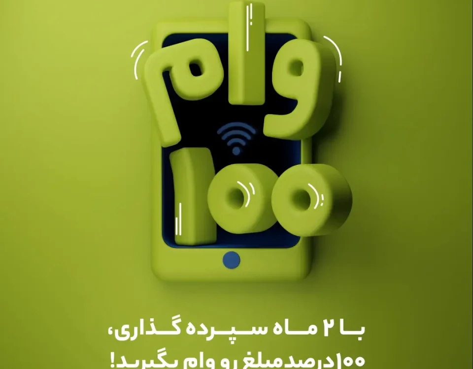
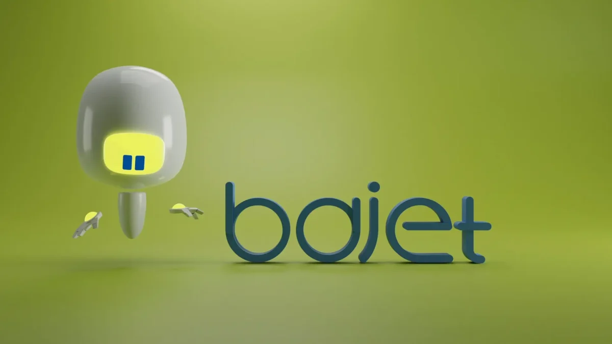
This SIMOTECH logo reveal announces the transformation of Simorgh Tejarat into SIMOTECH. The piece focuses on clarity and elegance: minimal shapes, purposeful timing, and a color system that reflects the brand’s new direction. Designed for social launch, it communicates innovation in seconds.
Concept & Direction
The concept visualizes rebirth and progress. Abstract motion elements symbolize transition; they converge to form the new SIMOTECH identity. Light shifts and color changes underline the move from the old system to a clean, tech-forward look. The pacing is calm but confident, so the logo lands with impact and legibility on mobile.
Production & Pipeline
I led the project as Director & Motion Designer, building the reveal in Adobe After Effects with precise easing, layered glows, and guided transitions that match the identity guidelines. Delivery targeted social formats from day one—16:9 master plus 4:5 / 9:16 cuts, poster frames, and captioned versions for accessibility.
Outcome
The video served as a rebranding announcement across SIMOTECH’s channels, presenting the new logo, palette, and tone in a modern, minimal style. It functions both as a concise brand statement and a reusable asset for future campaigns.


